With no plan in mind, I did what I always do with new releases, throw caution to the wind, select some colours and play, after all it's just card and no big deal if it doesn't work out. But I've said many times before that it doesn't seem to matter what colours you choose from the Distress palette, they always go together, even when you think they won't. Forget about the colour wheel, close your eyes, make your choices and have fun. I used Distress Mixed Media Heavystock for all the backgrounds and chose the Fired Brick/Faded Jeans background (bottom right) to use with Tim Holtz/Stampers Anonymous Distinguished, Inventor 7 and Stitches stamp sets.
I placed the background panel in my Stamp Platform held securely in place by every crafters' friend, a Tim Holtz/Sizzix Sticky Grid Sheet, the perfect solution when you're using a large stamp and there's nowhere to place the magnets. These sheets have just the right amount of tackiness, are so much more user friendly, they don't clash together and nip your fingers and they don't fly across your desk to attach themselves to your scissors at every opportunity. Consider me converted.
I started off by stamping the Inventor 7 image with Fired Brick Distress Ink.
and added Faded Jeans Distress Ink through the Gradient Square Layering Stencil using a mini round blending tool. The magic sheet of stickiness is still holding the paper in place on the platform but if, unlike me, you don't want to get ink on your platform, you could remove it and stick it to your glass media mat, because they are re-usable and can be used over and over again before they lose their tackiness.I placed the background panel in my Stamp Platform held securely in place by every crafters' friend, a Tim Holtz/Sizzix Sticky Grid Sheet, the perfect solution when you're using a large stamp and there's nowhere to place the magnets. These sheets have just the right amount of tackiness, are so much more user friendly, they don't clash together and nip your fingers and they don't fly across your desk to attach themselves to your scissors at every opportunity. Consider me converted.
I started off by stamping the Inventor 7 image with Fired Brick Distress Ink.
I coloured a scrap of Distress Mixed Media Heavystock with Faded Jeans Distress Ink and spritzed with water to create the water droplet look. I stamped the label from Tim Holtz/Stampers Anonymous Label Frames, the hat, jacket and sign from Distinguished with Distress Black Soot Archival, stamped the clock image over the label with Distress Fired Brick Archival and fussy cut.
I fixed the label frame to the panel using Distress Collage Medium Matte, the hat with Tim Holtz/Sizzix Mini Foam Adhesive to create dimension and added Idea-ology Postal and Journey Design Tape.
I added the jacket with Mini Foam Adhesive and an Idea-ology Quote Chip, lightly tinted with Vintage Photo and Faded Jeans Distress Archival inks, with Distress Collage Medium. I stamped the clock image again on to a scrap of Distress Mixed Media Heavystock, tinted with the same colours, fussy cut, covered with a generous coat of Glossy Accents and laid the Idea-ology Monocle on top. Once the Glossy Accents had dried, I fixed the Monocle in place with Mini Foam Adhesive.
At this stage I decided to add some light elements to tie in with his shirt and stamped the image from Stitches with Versamark ink, heat embossed with Ranger Superfine White Embossing Powder and toned down slightly with Walnut Stain Distress Oxide Ink. I tied Cream Eclectic Elements Thread to the Monocle.
I added more colour to the Quote Chip using Vintage Photo and Faded Jeans Distress Archival inks. I felt that the Journey Design Tape was a little lost on the background, so I added it to white card, cut out and fixed over the original tape.
And with that old saying "stop now while you're ahead" running through my mind, I matted the panel on to an A2 white card blank. I'll be back tomorrow to share another "Distress Oxide Spray" background card, with 2 entirely different colours and a more feminine theme.
Toodle-oo for now
Hugs Kath xxx

*** Where available I use compensated affiliate links which means if you make a purchase I receive a small commission at no extra cost to you. You can find my affiliate and product disclosure HERE
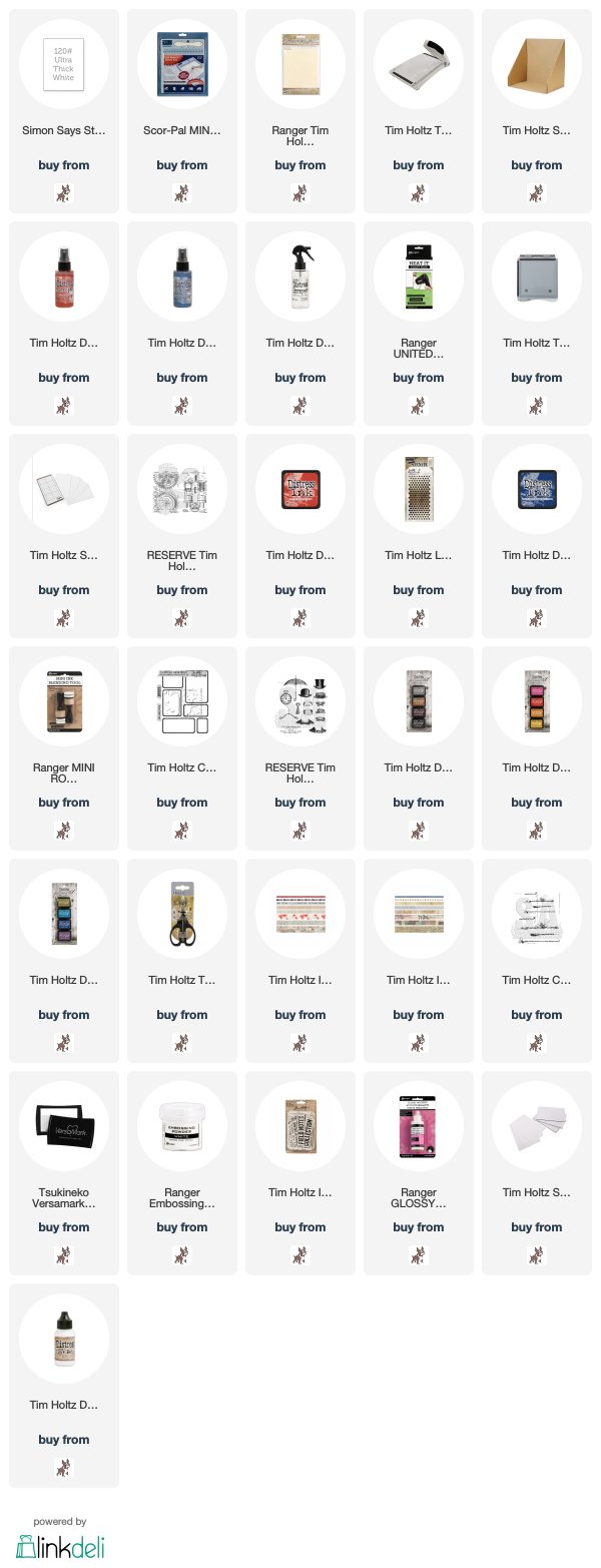
SUPPLIES:

*** Where available I use compensated affiliate links which means if you make a purchase I receive a small commission at no extra cost to you. You can find my affiliate and product disclosure HERE


love your creations
ReplyDeleteI’ve got to get myself some of that sticky grid... I accidentally purchased the wrong thing! This card looks amazing! I love the way you’ve worked the oxide background colors into the foreground with the distress inks and archival inks. The monacle looks fabulous with the timepiece stamp, so many super details! Thanks for sharing xx
ReplyDeleteAnother 'off the scale' fabulous creation Kath! The background you created is quite simply gorgeous! I genuinely thought the watch was real, this is such a clever idea and such a great use for that beautiful monocle!! Genius my friend!! Hugs, Anne xx
ReplyDeleteWOW I simply adore this Kath and those backgrounds OMG be still my beating heart! I am so desperately waiting for mine to arrive. Thank you for sharing.
ReplyDeleteHugs
Linda xxx
I have been an admirer from other blog hops but now I am addicted to your artwork, Kath! BUT - I have a question about the gorgeous work you did with the architectural stamp (cathedral!) - my printer absolutely shows you used blue ink and not black? Is there something wrong with my eyes or my printer???
ReplyDeleteYour ideas have really inspired me more than my pocketbook will allow - but I have on my wish list nearly every stampset you have used, lately! I especially have wanted to invest in AALL & Create stamps now that I have expanded past Tim Holtz and all of those marvelous stamps! Rub those furry ears for me, please - since you are too far away to do it myself! Love your chitchat on your blogs - I feel like we could easily be friends!
Mary in Oregon
blukazam@yahoo.com
Pinned this fabulous card! LOVE the background with the sprays and all the added stamped and ephemera!
ReplyDelete