and the theme for this week is...
TYPOGRAPHY
definition: the study of the design of typefaces and the way in which the type
is laid out on a page to achieve the desired visual effect
TYPOGRAPHY
definition: the study of the design of typefaces and the way in which the type
is laid out on a page to achieve the desired visual effect
I created a Vintage Sepia look page in my Dina Wakley Media Journal using Tim Holtz/Sizzix Word Play Bigz die for the wording and to add texture to the background.
I die-cut lots of letters from scraps of white card using Tim Holtz Word Play Bigz die and fixed them to the Cotton Rag Watercolor pages using Dina Wakley Clear Gesso. I then applied a coat of Clear Gesso over both pages to seal the surface ready to have some fun with paint.
I spritzed the pages generously with water and dabbed on Antique Linen Distress Paint and let the water work it's magic and move the paint around. I dried the pages and repeated the process with Frayed Burlap Distress Paint.
I spritzed the pages with Hickory Smoke Spray Stain and tilted the journal to let the stain run into the crevices of the letters. I dried and spritzed again in places until I was happy with the background.
I inked the camera image from Tim Holtz/Stampers Anonymous Inventor 8 with Black Soot Archival and stamped on to Idea-ology Plain Collage Paper.I drew around the image with a wet paint brush, teased the excess paper away with my finger and fixed to the page with Distress Collage Medium Matte.
I inked one of the images from Tim Holtz/Stampers Anonymous Fragments with Hickory Smoke Archival ink and stamped randomly on the pages.
I added Idea-ology Film Strip Ribbon and Word Play die-cut letters
coloured in the same way as the letters on the left hand page
I inked the script image from Tim Holtz/Stampers Anonymous Entomology with Black Soot Archival Ink and stamped randomly on both pages
and added splatters of Black Soot Distress Spray Stain
I roughed up the edges of Idea-ology Found Relatives and Photobooth with Tim Holtz Paper Distresser, applied a coat of Distress Vintage Collage Medium and sanded lightly. I added to the page with sections of Idea-ology Film Strip Ribbon and created shadows around the edges of the collage pieces and the lettering on the right hand page with a Black Soot Distress Crayon, faded out using a Detailer Water Brush.I added Dina Wakley Media Tape and Collage Words fixed in place with Distress Collage Medium
Idea-ology Tiny Text Remnant Rubs and a Small Talk Chit Chat Sticker.
Why don't you pop over to the Monday Challenge Blog and check out the amazing creations from my very talented Design Team mates and as always you all have the chance to win a $50 gift voucher to spend at Simon Says Stamp. You have until Monday 8am Ohio time...1pm UK time...2 pm CET to join in...
You can also follow Simon Says Stamp on Instagram
and if you use Instagram...
please add #sssmchallenge to your entry uploads so we can see them on there too
I look forward to seeing what you create this week...
Have Fun and Happy Crafting
Hugs Kath xxx
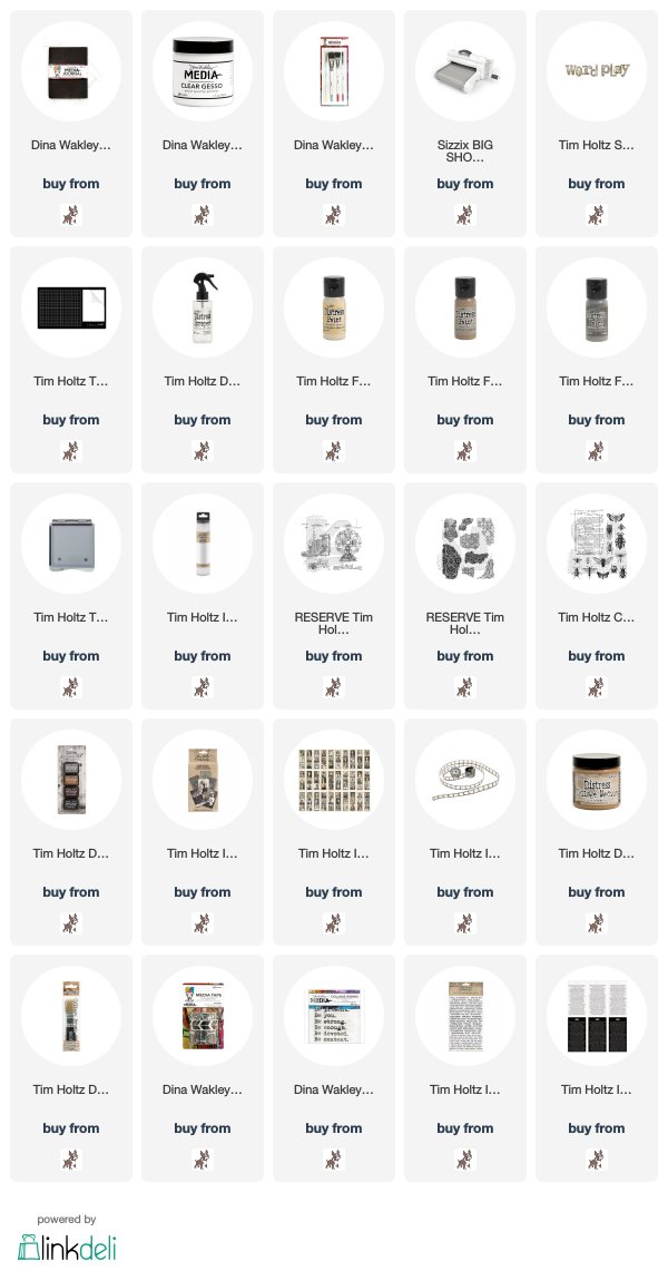
SUPPLIES:

*** Where available I use compensated affiliate links which means if you make a purchase I receive a small commission at no extra cost to you. You can find my affiliate and product disclosure HERE.


Really enjoyed reading this 'how to' Kath, far better than just seeing the finished results, thankyou for sharing, I really love the pages, amazing.x
ReplyDeleteGorgeous Kath, love all those wonderful layers and the colours are fantastic. Love ❤️❤️
ReplyDeleteOh WOW Kath!! this is a showstopper!! the sepia tones and layered details are absolutely gorgeous!! Totally LOVe this!! ❤️❤️❤️
ReplyDeleteHope you have a great week and be sure to set your alarm for any upcoming appointments, we don't want you to miss any, hehe ;-)
luv
Lols x x x
Beautiful spread Kath. Gorgeous design. The mood you created with sepia is breathtaking.
ReplyDeleteLula xx
WOW! This is awesome! I love the layers, textures and design.
ReplyDeleteHugs
Linda xxx
Stunning pages! Hugs, Sarah
ReplyDeleteOMG I would love to see your journal IRL - what fabulous pages
ReplyDeleteGorgeous!
ReplyDeleteI have been saving those post until this evening so I could spend time just looking at this wonderful journal page! It is fabulous Kath, I love how you used the Word Play letters and how you built up the background colour. The fabulous camera is just the icing on the cake, it is gorgeous (I have an old camera that looks just like this). Hugs, Anne xx
ReplyDeleteKath you are absolutely an eclectic artist! the way yoo move between different styles is incredible! This page is perfection! Colors and design work so well and the vintage feeling you gave to this work is amazing! Barbara
ReplyDeleteThis is GORGEOUS! The color palette is stunning and the splatters in the background are perfect. This is elegant and industrial and I think it's fabulous!
ReplyDeleteBeautiful and so warm! Love the sephia and all the elements making this project so cozy. Great background with spread letters and the washi tape with scribbles is so cool! Hugs x
ReplyDeleteWonderful pages, Kath! Love the vintage step back in time, and the sepia is wonderful. That big typeface looks wonderful in the background. hugs, Maura
ReplyDeleteGorgeous Kath, I adore your colour palette and wonderful interpretation of the Typography theme, thanks so much for sharing it! Deb xo
ReplyDeleteLove your fantastic art journal pages! Kath. The vintage effect and all the details on these pages are so stunning. :)
ReplyDeleteThis journal spread is fantastic Kath! I love how you made the letters a part of the background and all the details and words, and images are so perfect together.
ReplyDelete